90% of information the brain receives is visual. It is therefore incredibly important to have some kind of visual stimuli on your website to avoid an overwhelming wall of text. That’s why website photography is so necessary.
Having developed many websites and shot commercial photography before, we know how much photography can add to a webpage. Photographs are a good way to insert some life into your page and are easier to do than graphics. Although done poorly can look tacky and lazy.
Here are three do’s and three don’ts when it comes to website photography.
DO use relevant photos
On average, a visitor to a webpage will only read about 30% of the text there, so some relevant photography that makes it obvious what you are talking about can be extremely beneficial. You want to make sure each photo you use is significant and isn’t just filler.
Photos are great at reinforcing a point you make. For example, if you have a positive message you are trying to portray, show some positive imagery. A photo of happy, smiling people will invoke the positive emotions in your website visitors better than any amount of text can.
DON’T use tacky stock images
Low quality stock photos on the other hand should be avoided at all costs. They are rarely 100% relevant as they have not been taken with your specific point in mind and look cheesy and cheap.
As they are available to everyone, you run the risk that other companies are using the same images. The human eye is great at recognising faces so if you are using the same photo of people as another website you are no longer unique and this can distract visitors.
I’d say the only place stock images can be used on a website is the blog. A post consisting of just text can be a pain to read and the blog is often updated frequently so to create new images for every blog post can take a long time. On your regular webpages however, you should have unique images that represent your business and your work.
DO have photography of people
Photographs of your team and/or your clients humanises your brand as people relate to seeing other people. It’s more welcoming and warm to new potential customers.
This is a particularly important point for companies providing a face to face service like an estate agency or property manager. Visitors feel like they meet you before they actually do and can go a long way in removing awkwardness and nerves of a first meet, especially with more introverted people.
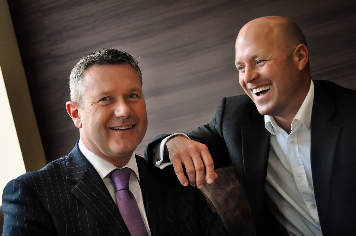
Here’s a photo we took as part of a shoot we did for Aston Mead Estate agents. The focus was to make the brand more personable and welcoming.
DON’T use poorly produced photos
One mistake we see often however is poorly produced photographs, in particular headshots. It’s all very well having your team photos on your website, but if they are grainy and poorly lit it can look very unprofessional and cheap. It can bring down how the rest of the page looks as photos are the first thing people look at. First impressions are of course pivotal, so aim to have clean, bright photos that catch the eye. Here’s a link to Hubspots guide on how to take a business headshot.
It’s not just about headshots though. It can be your product, your office. Every photo on your website should be taken with care!

For this photo, the production had to be high to show of a development from our clients at the Heyford Park Development Group. Carefully placed lights and multiple shots were combined to make the image look as good as possible. It’s crazy how much better a photo can look with the correct equipment.
DO make sure your images work on mobile devices
With more and more people preferring to access websites through phones and tablets, you need to consider how your website photographs and images will look on mobile devices.
Having small details in photographs may be easy enough to see on a desktop, may be too intricate on a smaller screen. Likewise with text in a photo, by the time it has been shrunken down it may be illegible. Also, if the photo is much wider than it is tall, like a panoramic or a banner style photo, then on mobile devices it could just look like a strip and be difficult to make out anything in it.
Try to keep your photos simple and bold enough to catch the viewer’s eye, regardless of the size of screen they are looking at.
DON’T go overboard with your website photography
The age old adage ‘less is more’ holds true. Fewer, bolder photos are better than lots of little images. In the same way that you don’t want to overwhelm the visitor with a wall of text, you don’t want to overwhelm them with a cluster of photos either.
We have many more web design tips on our blog and can help you make the most out of your website. Why not check out our post on pop-ups and how they can benefit your business.
We focus on lead generation, so give us a call to find out how you can optimise your website to get more quality leads.
Book a No-Obligation 30 minutes call with our web design experts
Our 30 minute “getting-to-know-you” phone call is designed to see if your project is something we are able to help with. Be prepared to discuss your business fundamentals, your hopes & expectations of your project and your current business challenges. Schedule a call now.


